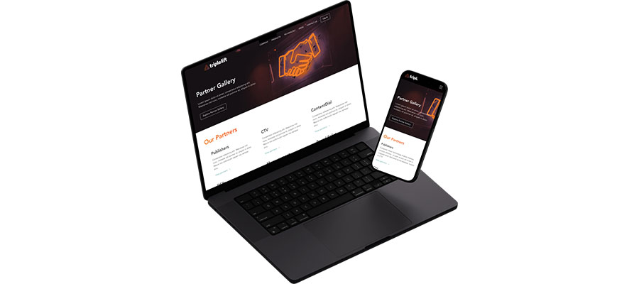
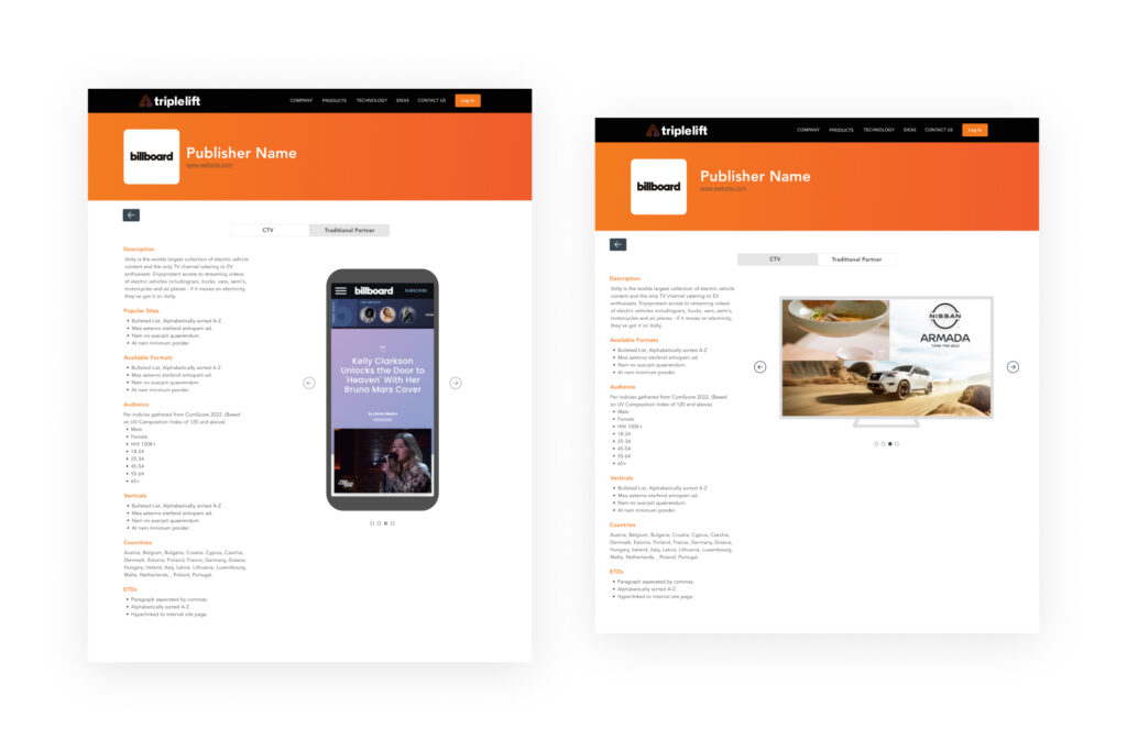
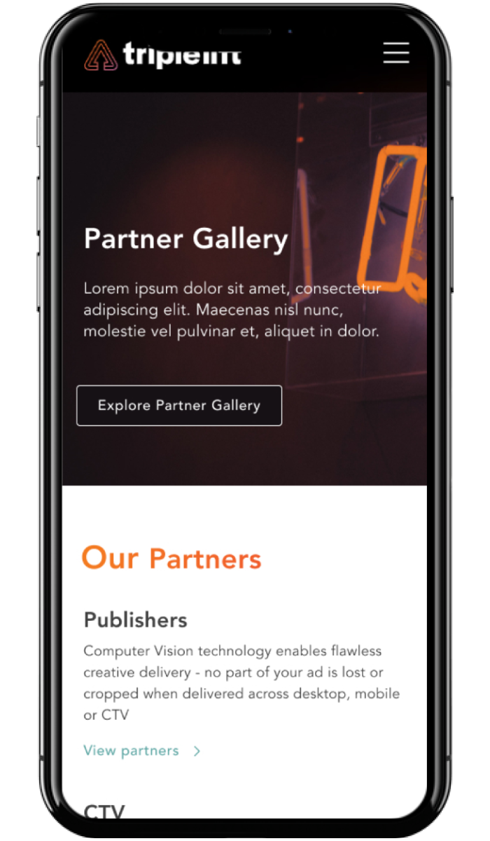
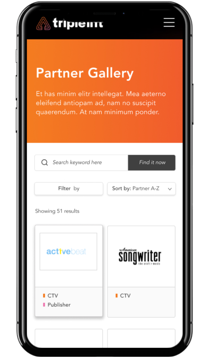
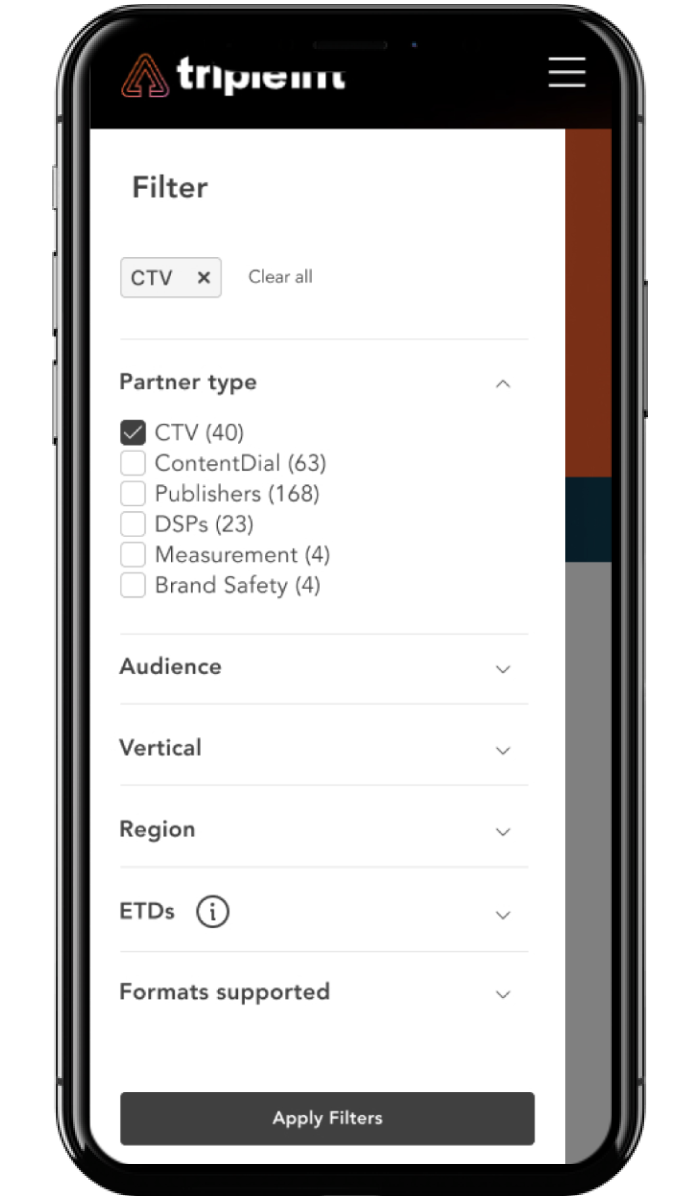
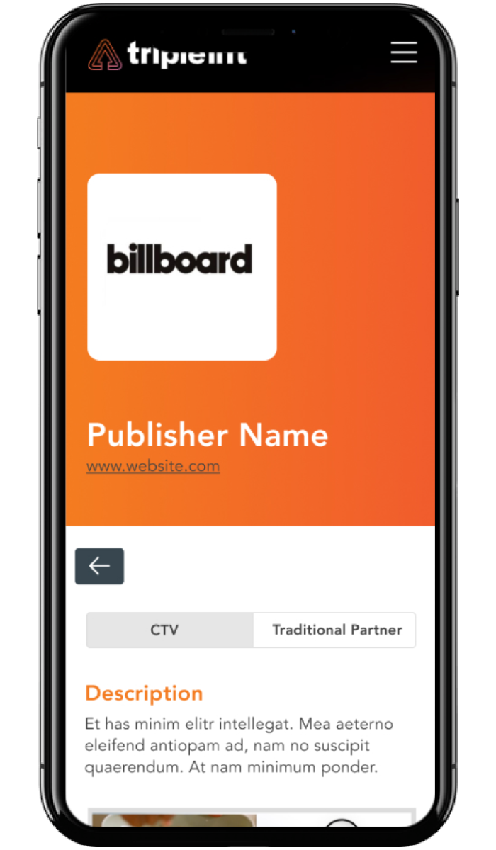
The Partner Gallery is an innovative tool designed to showcase TripleLift’s top-tier partners in an interactive manner. Users can easily browse and learn about over 500 partners based on various criteria, which increases interest and education about these partners. The tool aims to reduce the reliance on internal resources for partner information by making it readily accessible and visually appealing.
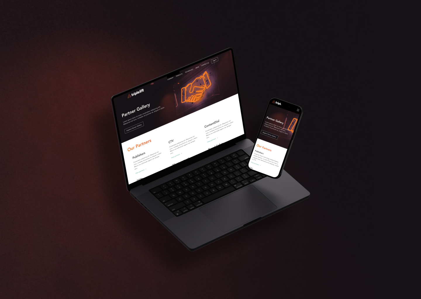
Partner Gallery
Web Filtering Tool
As the UX/UI designer for the project, I was tasked with creating an interactive tool that allows users to explore and learn about over 500 partners, enhancing user engagement and reducing the time spent with internal resources.
Interactive tool to streamline partner exploration and education.
About TripleLift
Headquarters: New York, NY | Founded: 2012 | Industry: AdTech | Company Size: 500+ | Revenue: $95.3M (2024)
The Challenge
Our Goal
Key Components
- Interactive Partner Browsing
- Visually Engaging Design
- Intuitive Navigation
- Custom Link Sharing
- Educational Resources
Technology Used
- Figma
- FigJam
- Photoshop
- Monday.com
Design Thought Process
What Was Delivered
The Partner Gallery project resulted in a highly interactive tool that significantly improved user engagement and education about TripleLift’s partners. The tool’s intuitive design have enabled the sales team to efficiently present partner information to clients, reducing internal resource usage. This led to increased client interest in private marketplaces and better understanding of premium publishers.

